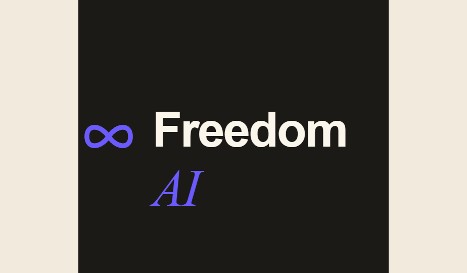
Freedom AI
Brand Guide
The voice, look, and feel of the 24/7 AI receptionist for local business. Warm, confident, human — high-end software that still feels like it answers your phone with a smile.
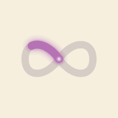
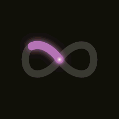
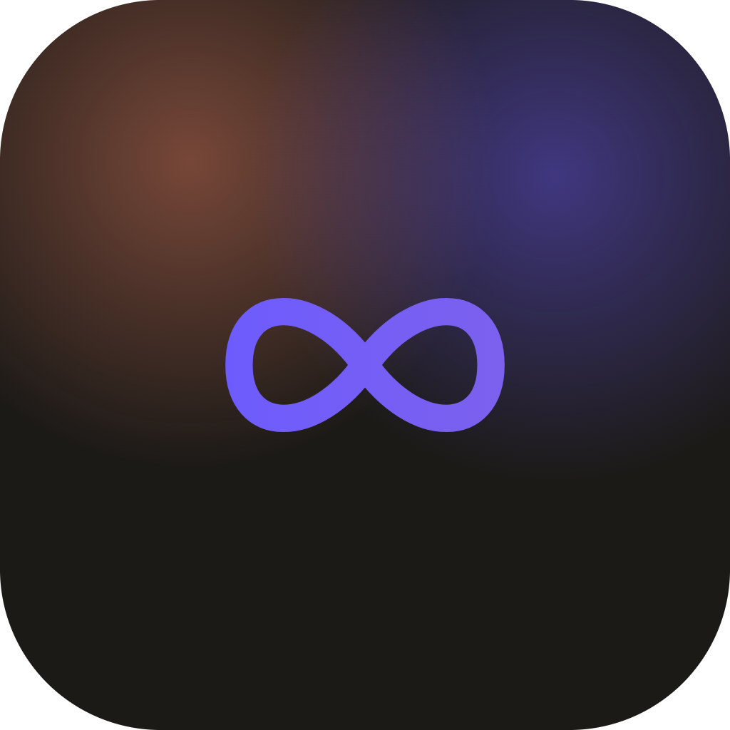
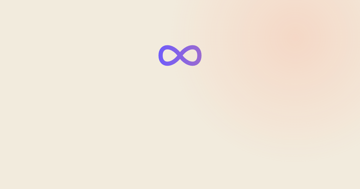
An infinity loop with a
light that warms as it travels.
The Continuum mark — an ∞ traced by a single light that shifts from iris to peach as it loops — is our promise made visual: always on, every call, no end. The duotone keeps the cool "intelligent AI" signal while staying warm and human — and unmistakably our own. Paired with the wordmark (Freedom in Geist, AI in Instrument Serif italic), it's the signature lockup.
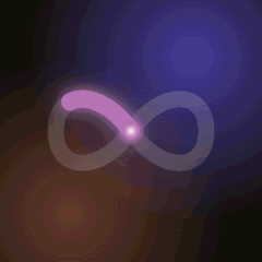
Use the animated mark as a loader, a hero accent, or a profile/email picture. GIF for email & social; animated SVG for the web (crisp at any size, tiny file). Keep it to one loop in view — never decorative filler.
Keep clear space equal to the mark's height on all sides. Don't render the lockup below 20px mark height (favicon uses the mark alone, which holds down to 16px).
Ink on sand, lit by iris & peach.
A warm, tactile paper foundation (sand & cream) grounds the brand in something human. Iris is the electric "live / AI" anchor; peach is its warm partner — together they form the signature duotone. Lead with iris, support with peach (the two flow into each other in the logo). Moss and gold stay rare, for success and ratings.
A magazine voice for a
software product.
Big Instrument Serif headlines give warmth and editorial confidence; Geist keeps the body clean and modern; Geist Mono adds a precise, technical texture to labels and data — the "live system" feel.
All three are free & open-source (OFL / MIT). Instrument Serif from Google Fonts; Geist & Geist Mono from Vercel (also on GitHub vercel/geist-font). Web pages load them automatically — these downloads are for Office, Canva, Slides & print.
Signals of a live line.
Recurring elements that make the product feel alive and answered. Use them with restraint — one or two per view.
The live dot
A pinging iris (or red, for inbound) dot = something is happening now. On status pills, eyebrows, nav.
The waveform
Iris→peach gradient bars = the AI speaking. The product is voice; show the voice — and the duotone makes it ours.
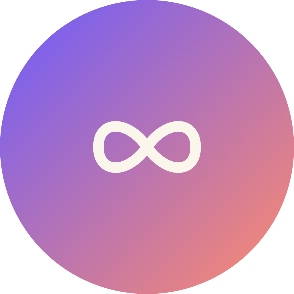
The Continuum
The light that shifts iris→peach as it loops. Use as logo, loader, or a quiet hero accent. Never decorative filler.
Mono pills
Small mono chips carry status & data with a technical, credible texture.
Gradient avatars
Initials on warm gradients stand in for real people — owners, callers, patients.
Ambient blobs
Soft, blurred, multiply-blended color drift behind warm paper. Atmosphere, never foreground.
Direct, warm, and never robotic.
We sell relief, not technology. Lead with the pain (missed calls = lost money), then the calm (it just answers, 24/7). Plain-spoken, confident, a little human wit. Never hype-y, never "synergy."
Paste this to brief any
designer, writer, or AI.
Drop this at the top of a chat to instantly load Freedom AI's brand direction and style. Tweak the brackets for the task at hand.
Everything you need to ship.
Grab the whole kit in one click, or pull individual files below. Vector marks scale from favicon to billboard; PNGs and the email GIF are ready for places that need raster.